|
User Guide - Web Site Global Settings
Page Background
- Background Color - Specifies the background color of the page outside of (behind) the table.
- Background Image Name - Allows you to place an image as your background. Upload your image, then add the image file name in this space, including the extension. Allowed file types are .JPG, .GIF, & .PNG. The image will tile to fill the entire background.
Click  to view Stock Backgrounds. To use a Stock Background, copy the entire path & filename from the viewer, then paste in the Background Image Name field. You may also upload your own background image and type its File Name in the field (ex: yourimage.jpg). to view Stock Backgrounds. To use a Stock Background, copy the entire path & filename from the viewer, then paste in the Background Image Name field. You may also upload your own background image and type its File Name in the field (ex: yourimage.jpg).
- Background Margin Width - Specifies the left & right minumum margins (dependent on Table Width & Alignment), in pixels, between the browser window and your table. (Default is 10, Set to 0 for none.) If your table width is set to 100% and your Background Margin Width is set to 10, then their will be a 10 pixel margin between the left & right browser window edge and your table edge.
- Background Margin Height - Specifies the top margin, in pixels, between the browser window and your table. (Default is 10, Set to 0 for none.)
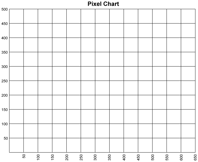
 Upload Image - Computer graphics and small images. Use this button to upload images that are 1000 pixles or less that do not need to be reduced. Click here for Pixel Chart. Upload Image - Computer graphics and small images. Use this button to upload images that are 1000 pixles or less that do not need to be reduced. Click here for Pixel Chart.
.JPG, .GIF, and .PNG images may be uploaded. Your image should have a UNIQUE file name. If your File Name is already used, then the older file will be OVERWRITTEN. You may choose to overwrite an older image simple by uploading an image with the same file name of the image you wish to overwrite.
Once the image has uploaded, you may insert it into your page using the Image button  . Find your new image under the MY FILES tab. . Find your new image under the MY FILES tab.
Table Settings
- Table Width - Specifies the width, in pixels, of the entire table within the browser window. Maximum recommended width is 1005. The most popular width is 960. You may also use percent (%) for a flexible, responsive design (e.g. 100%, 90%, etc.).
- Table Alignment - You may align your table to the LEFT or CENTERED in the browser window.
- Table Cell Padding - Specifies the space, in pixels, between the cell wall and the cell content.
- Table Cell Spacing - Specifies the space, in pixels, between cells.
- Table Border Size - Specifies the size, in pixels, of the border around your table. (Set to 0 for none)
- Table Border Color - Specifies the border color if your table has a border.
Header
| Icon |
Description |
 |
"Source Editor" button for HTML editing.
|
 |
"Full Screen" button. |
 |
"Search" button. |
 |
"Remove Formatting" button. |
 |
"Clear All" button. |
 |
"Undo" button. |
 |
"Redo" button. |
 |
"Cut" button. (Not available in Mozilla browsers.) |
 |
"Copy" button. (Not available in Mozilla browsers.) |
 |
"Paste" button. |
|
|
 |
"Font Name" dropdown. |
 |
"Font Size" dropdown. |
 |
"Paragraph" dropdown. |
 |
"Text Style & Formatting" button.
This button opens a menu which has:
- "Fonts" menu item
- "Size" menu item
- "Shadows" menu item
- "Paragraphs" menu item
- "Listings" menu item
|
 |
"Fonts" button. |
 |
"Text Color" button. |
 |
"Text Background Color" button. |
 |
"Bold" button. |
 |
"Italic" button. |
 |
"Underline" button. |
 |
"Strikethrough" button. |
 |
"Superscript" button. |
 |
"Subscript" button. |
 |
"Quote" button. |
 |
"Style Selection" button. |
|
|
 |
"Justify Left" button. |
 |
"Justify Center" button. |
 |
"Justify Right" button. |
 |
"Justify Full" button. |
 |
"Bullets" button. |
 |
"Numbering" button. |
 |
"Indent" button. |
 |
"Outdent" button. |
|
|
 |
"Insert Table" button. |
 |
"Edit Table" button. |
|
|
|
"Image" button. |
 |
"YouTube" button. |
 |
"Flash" button. |
 |
"Emoticons" button. |
 |
"Hyperlink" button. |
 |
"Internal Link" button. |
 |
"Bookmark" button. |
 |
"Custom Object" button. |
|
|
 |
"Special Characters" button. |
 |
"Horizontal Line" button. |
 |
"Custom Tag" button. |
 |
"Custom Caption" button. |
Navigation Menu
- Choose your Navigation Menu Style - Specifies the orientation of the Navigation Menu. Left Verticle or Horizontal.
- Background Color - Specifies the background color of the Navigation Menu in the table.
- Left Menu Width - Specifies the width, in pixels, of the Navigation Menu. ONLY for Left Vertical style.
- Menu Font - Specifies Font of Links on the Navigation Menu.
- Font Size - Specifies Font Size of Links on the Navigation Menu.
- Weight - Specifies Weight of Links on the Navigation Menu. BOLD or NORMAL.
- Link Color - Specifies Color of Links on the Navigation Menu.
- Underline - Underline Links on the Navigation Menu. Choose None for No Underline.
- Hover Color - Specifies Color of ACTIVE Links on the Navigation Menu (When mouse is placed on the link).
- Underline - Underline ACTIVE Links on the Navigation Menu. Choose None for No Underline.
- Visited Link Color - Specifies Color of VISITED Links on the Navigation Menu (Pages already viewed).
- Underline - Underline VISITED Links on the Navigation Menu. Choose None for No Underline.
- Vertical Menu Extras - This area will display below your Links. (ONLY visible for LEFT VERTICAL Menu Style.)
Use for text, Social Icons, logos, etc... Remember, this area renders only as wide as your LEFT MENU WIDTH setting.
Content Area
- Content Background Color - Specifies Background Color of the Content Area.
- Link Color - Specifies Color of Links in the Content Area.
- Underline - Underline Links in the Content Area. Choose None for No Underline.
- Hover Color - Specifies Color of ACTIVE Links in the Content Area (When mouse is placed on the link).
- Underline - Underline ACTIVE Links in the Content Area. Choose None for No Underline.
- Visited Link Color - Specifies Color of VISITED Links in the Content Area (Pages already viewed).
- Underline - Underline VISITED Links in the Content Area. Choose None for No Underline.
Footer
- Footer Background Color - Specifies the background color of the Footer cell in the table. This is typically where you will place your contact information, copyright notice, etc.
- Content - Create your Footer content using the buttons on the menu bar to format your text, insert pictures, create hyperlinks, etc. You may also copy content from another source, such as a Word Document, and paste it directly into the Content Editor (You may need to touch up formatting). Your Footer will appear on the web site just as it does in the Content Editor.
|


